Painless anomaly detection (using PyOD) with Apache Airflow.
Note: If you are interested in a more generic approach to anomaly detection that does not need or use Airflow, check out Anomstack


How it works in a 🌰:
- Create and express your metrics via SQL queries (example here).
- Some YAML configuration fun (example here, defaults here).
- Receive useful alerts when metrics look anomalous (example here).
The example dag will create 4 dags for each "metric batch" (a metric batch is just the resulting table of 1 or more metrics created in step 1 above):
<dag_name_prefix><metric_batch_name>_ingestion<dag_name_suffix>: Ingests the metric data into a table in BigQuery.<dag_name_prefix><metric_batch_name>_training<dag_name_suffix>: Uses recent metrics andpreprocess.sqlto train an anomaly detection model for each metric and save it to GCS.<dag_name_prefix><metric_batch_name>_scoring<dag_name_suffix>: Uses latest metrics andpreprocess.sqlto score recent data using latest trained model.<dag_name_prefix><metric_batch_name>_alerting<dag_name_suffix>: Uses recent scores andalert_status.sqlto trigger an alert email if alert conditions are met.
Example output of an alert. Horizontal bar chart used to show metric values over time.
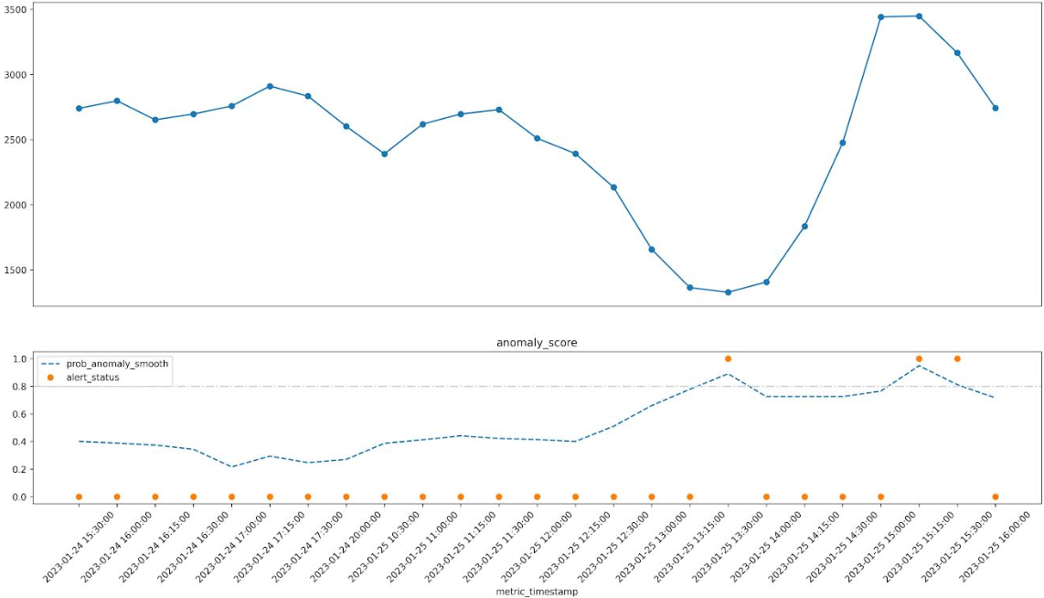
Smoothed anomaly score is shown as a % and any flagged anomalies are marked with *.
In the example below you can see that the anomaly score is elevated when the metric dips and also when it spikes.
🔥 [some_metric_last1h] looks anomalous (2023-01-25 16:00:00) 🔥
some_metric_last1h (2023-01-24 15:30:00 to 2023-01-25 16:00:00)

t=0   ~~~~~~~~~~~~~~~~~~~~~~~~~~~~~~~~~~~~~~~             2,742.00    72% 2023-01-25 16:00:00
t=-1  ~~~~~~~~~~~~~~~~~~~~~~~~~~~~~~~~~~~~~~~~~~~~~       3,165.00  * 81% 2023-01-25 15:30:00
t=-2  ~~~~~~~~~~~~~~~~~~~~~~~~~~~~~~~~~~~~~~~~~~~~~~~~~~  3,448.00  * 95% 2023-01-25 15:15:00
t=-3  ~~~~~~~~~~~~~~~~~~~~~~~~~~~~~~~~~~~~~~~~~~~~~~~~~   3,441.00    76% 2023-01-25 15:00:00
t=-4  ~~~~~~~~~~~~~~~~~~~~~~~~~~~~~~~~~~~                 2,475.00    72% 2023-01-25 14:30:00
t=-5  ~~~~~~~~~~~~~~~~~~~~~~~~~~                          1,833.00    72% 2023-01-25 14:15:00
t=-6  ~~~~~~~~~~~~~~~~~~~~                                1,406.00    72% 2023-01-25 14:00:00
t=-7  ~~~~~~~~~~~~~~~~~~~                                 1,327.00  * 89% 2023-01-25 13:30:00
t=-8  ~~~~~~~~~~~~~~~~~~~                                 1,363.00    78% 2023-01-25 13:15:00
t=-9  ~~~~~~~~~~~~~~~~~~~~~~~~                            1,656.00    66% 2023-01-25 13:00:00
t=-10 ~~~~~~~~~~~~~~~~~~~~~~~~~~~~~~                      2,133.00    51% 2023-01-25 12:30:00
t=-11 ~~~~~~~~~~~~~~~~~~~~~~~~~~~~~~~~~~                  2,392.00    40% 2023-01-25 12:15:00
t=-12 ~~~~~~~~~~~~~~~~~~~~~~~~~~~~~~~~~~~~                2,509.00    41% 2023-01-25 12:00:00
t=-13 ~~~~~~~~~~~~~~~~~~~~~~~~~~~~~~~~~~~~~~~             2,729.00    42% 2023-01-25 11:30:00
t=-14 ~~~~~~~~~~~~~~~~~~~~~~~~~~~~~~~~~~~~~~~             2,696.00    44% 2023-01-25 11:15:00
t=-15 ~~~~~~~~~~~~~~~~~~~~~~~~~~~~~~~~~~~~~               2,618.00    41% 2023-01-25 11:00:00
t=-16 ~~~~~~~~~~~~~~~~~~~~~~~~~~~~~~~~~~                  2,390.00    39% 2023-01-25 10:30:00
t=-17 ~~~~~~~~~~~~~~~~~~~~~~~~~~~~~~~~~~~~~               2,601.00    27% 2023-01-24 20:00:00
t=-18 ~~~~~~~~~~~~~~~~~~~~~~~~~~~~~~~~~~~~~~~~~           2,833.00    25% 2023-01-24 17:30:00
t=-19 ~~~~~~~~~~~~~~~~~~~~~~~~~~~~~~~~~~~~~~~~~~          2,910.00    28% 2023-01-24 17:15:00
t=-20 ~~~~~~~~~~~~~~~~~~~~~~~~~~~~~~~~~~~~~~~             2,757.00    22% 2023-01-24 17:00:00
t=-21 ~~~~~~~~~~~~~~~~~~~~~~~~~~~~~~~~~~~~~~~             2,696.00    34% 2023-01-24 16:30:00
t=-22 ~~~~~~~~~~~~~~~~~~~~~~~~~~~~~~~~~~~~~~              2,651.00    37% 2023-01-24 16:15:00
t=-23 ~~~~~~~~~~~~~~~~~~~~~~~~~~~~~~~~~~~~~~~~            2,797.00    39% 2023-01-24 16:00:00
t=-24 ~~~~~~~~~~~~~~~~~~~~~~~~~~~~~~~~~~~~~~~             2,739.00    40% 2023-01-24 15:30:00
Below is the sql to pull the metric in question for investigation (this is included in the alert for convenience).
select *
from `metrics.metrics` m
join `metrics.metrics_scored` s
on m.metric_name = s.metric_name and m.metric_timestamp = s.metric_timestamp
where m.metric_name = 'some_metric_last1h'
order by m.metric_timestamp descA slightly more fancy chart is also attached to alert emails. The top line graph shows the metric values over time. The bottom line graph shows the smoothed anomaly score over time along with the alert status for any flagged anomalies where the smoothed anomaly score passes the threshold.
Check out the example dag to get started.
- Currently only Google BiqQuery is supported as a data source. The plan is to add Snowflake next and then probably Redshift. PR's to add other data sources are very welcome (some refactoring probably needed).
- Requirements are listed in requirements.txt.
- You will need to have sendgrid_default connection setup in airflow to send emails. You can also use the
sendgrid_api_keyvia environment variable if you prefer. See.example.envfor more details. - You will need to have a
google_cloud_defaultconnection setup in airflow to pull data from bigquery. See.example.envfor more details.
Install from PyPI as usual.
pip install airflow-provider-anomaly-detectionSee the example configuration files in the example dag folder. You can use a defaults.yaml or specific <metric-batch>.yaml for each metric batch if needed.
You can use the docker compose file to spin up an airflow instance with the provider installed and the example dag available. This is useful for quickly trying it out locally. It will mount the local folders (you can see this in docker-compose.yaml) into the container so you can make changes to the code or configs and see them reflected in the running airflow instance.
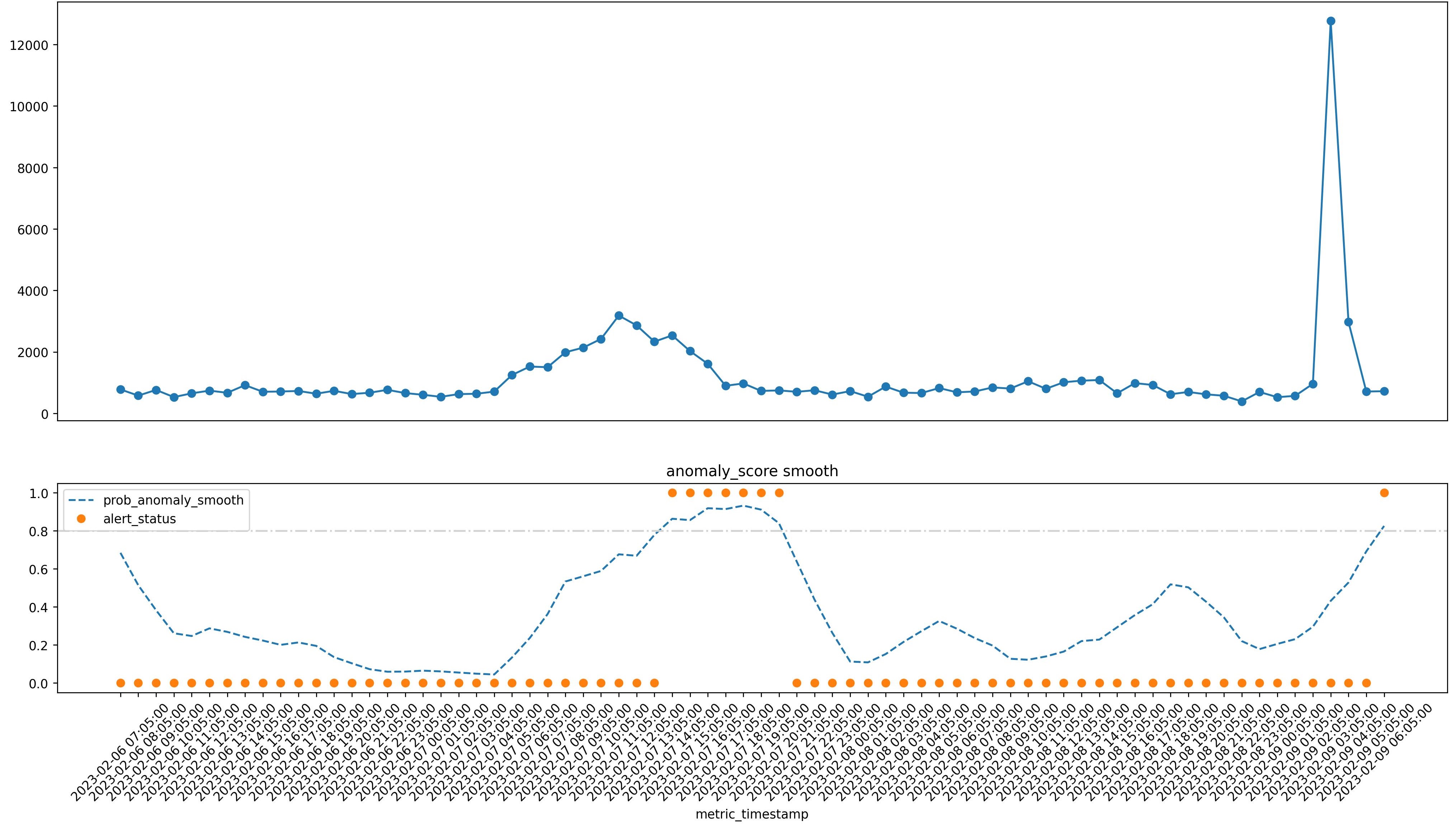
docker compose up -dLook at some of these beautiful anomalies! (More at /anomaly_gallery/README.md)
(these are all real anomalies from various business metrics as i have been dogfooding this at work for a little while now)
Sharpe drop in metric followed by an elevated anomaly score.
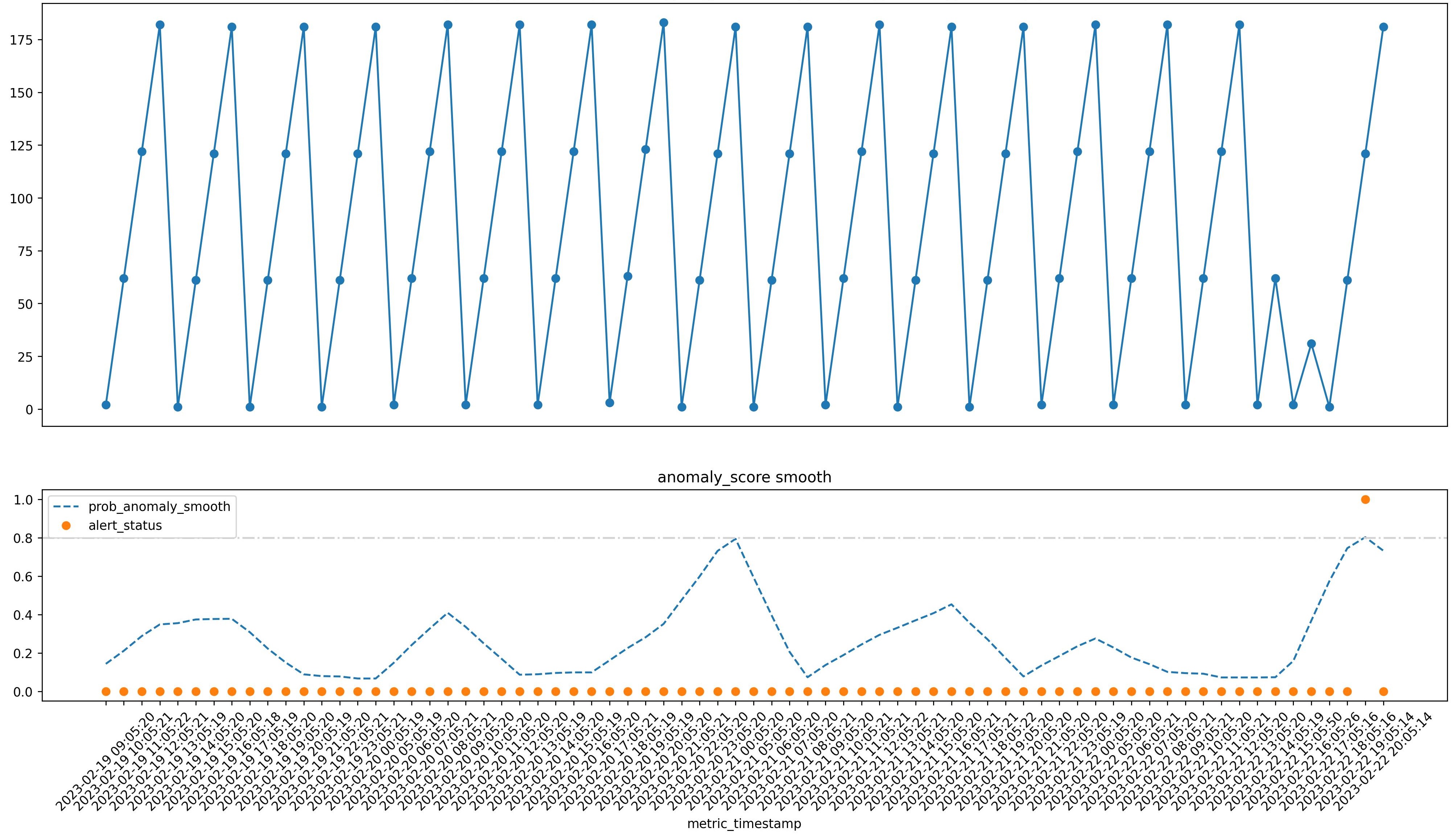
A subtle change and some "saw tooth" behaviour leading to an anomaly.
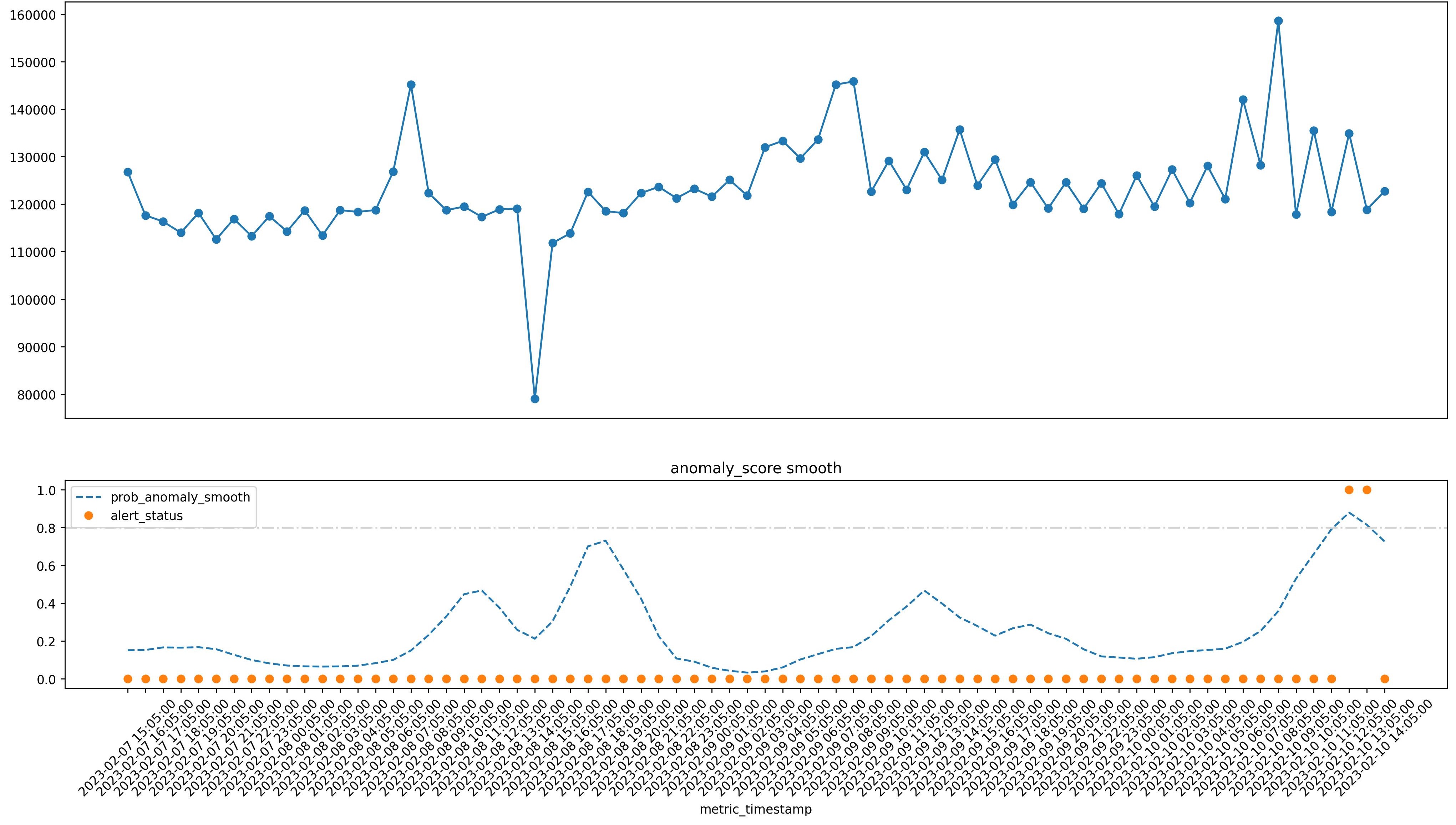
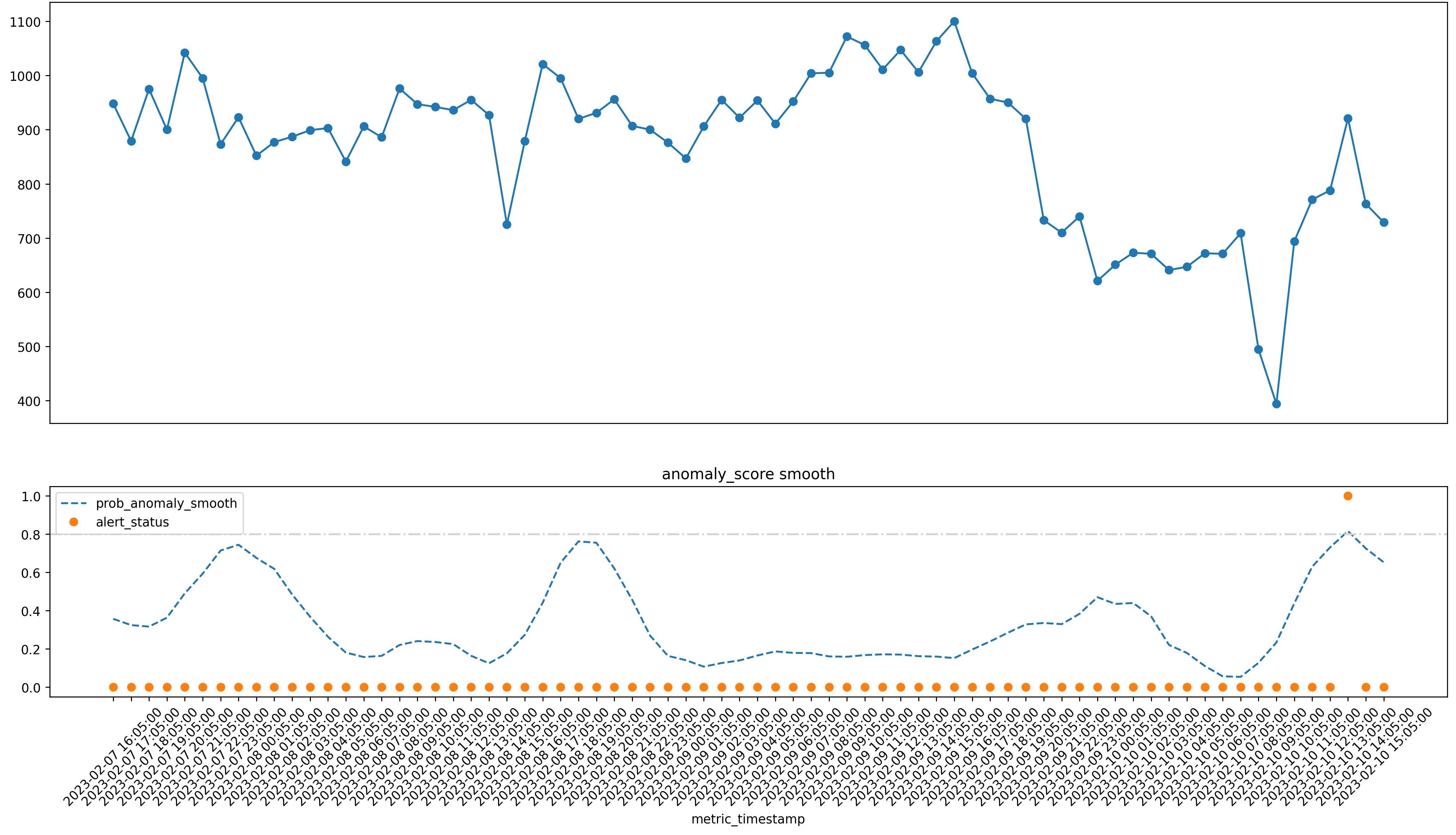
A bump and spike example - two anomalies for one!
An example of a regular ETL timing delay.